Philadelphia, PA — Moore College of Art & Design, the first and only historically all-women’s art and design school in the nation, is unveiling a new look during this challenging year. A new logo, along with updated colors and a new typeface, are the hallmarks of a more contemporary brand for the College and its ecosystem of academic programs, which include co-ed graduate studies, youth education and adult continuing education offerings.
The award-winning firm Creative Communications Associates (CCA), a higher education marketing company in Troy, New York, developed Moore's brand-new logo and tagline: The World Needs Moore. Though the project began prior to the COVID-19 pandemic, Moore’s leadership made the decision to forge ahead and unveil the new brand this fall.
"There's no better time for us to reposition ourselves as an institution than in this moment when everything is changing," said Cecelia Fitzgibbon, president of Moore College of Art & Design. "There are very few organizations out there that have had the capacity to address the current public health situation while also thinking about the future. Our rebrand represents our commitment to Moore's future, and signals our intention to recapture and continue our forward momentum."
NEW COLORS
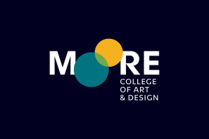
The College's new logo features overlapping circles in teal and gold that visually represent the Os in the name Moore. The circles may be animated in digital and video iterations and can serve as windows to student or faculty work.
"Our new brand conveys the exceptional quality of Moore students and of the education they receive here," said Chief Marketing and Communications Officer Nicole Steinberg. "The overlapping circles that stand in for the Os of our name are a metaphor for the Moore experience itself—the exciting connections that occur between students and faculty, the way our campus benefits from and gives back to the city of Philadelphia, and the way Moore students thrive at the intersection of creative passion and career success."
The new tagline, “The World Needs Moore,” speaks to Moore's history. The College was founded in 1848 because there was—and still is—a segment of the population not being served by existing academic institutions. Additionally, the tagline connotes the value of Moore's programs and the potential of its graduates. With nearly 200 years of groundbreaking alumni, including the first woman to design a postage stamp, Project Runway winners, Emmy award-winning costume designers, Pulitzer Prize-winning photographers, those who are shaping new fields like gaming and animation and special-needs art education, and successful independent design studios and creative companies—Moore graduates make an impact.
NEW TYPEFACE AND WEBSITE
Moore's new primary typeface is Utile, designed by Sibylle Hagmann for her type foundry, Kontour. Beyond being a bold and versatile typeface, Utile also has great resonance for the College as an institution. Developed by a woman who founded her own successful business, Utile is an apt expression of Moore’s founding mission—to advance women in new and creative industries.
The brand rollout also includes a fully redesigned website for Moore. CCA collaborated with Fastspot, a woman-led creative agency out of Baltimore, to redevelop and redesign the website with the user experience in mind.
